
Blog
The 3 second rule in website design: what the evidence says
The 3 second rule says a website has three seconds to load and make its point. Where the figure comes from, and what Google measures instead.
The 3 second rule in website design says a page has about three seconds to load and to show a visitor what it offers before they give up and leave. It is a rule of thumb, and no standards body publishes it. Google’s own loading target is stricter: the main content should render within 2.5 seconds for at least three in four visits.
This guide traces where the three seconds came from, what the research behind it actually measured, and how to check your own pages against the number Google uses.
What does the 3 second rule mean?
Ask a few web designers and you will hear two rules under one name. The first is about speed: if a page has not loaded within three seconds, many visitors abandon it. The second is about the message: once the page appears, a visitor decides almost at once whether it is meant for them, so the top of the page has to say what the business does and what to do next.
Most articles on the rule run the two together, and the AI summaries that quote those articles do the same. They are worth pulling apart, because they fail for different reasons and get fixed by different people. A slow page is an engineering problem. A page that loads quickly but leaves the visitor guessing is a writing and design problem.
Where the three seconds comes from
No single study set a three-second limit. The figure borrows support from several pieces of research, and each of them measured something narrower than the rule claims.
- Mobile abandonment, 2016. In a post called The need for mobile speed, Google wrote that “53% of visits are likely to be abandoned if pages take longer than 3 seconds to load.” The same post said most mobile sites missed that bar, going by Google’s analysis of more than 10,000 mobile web domains, and put the average mobile page at 19 seconds to load over a 3G connection.
- Response times, 1993. Jakob Nielsen’s three response-time limits treat one second as roughly the longest delay a person can wait without losing their train of thought, and ten seconds as roughly the point where attention wanders off to something else. Three seconds sits between the two.
- First impressions, 2006. A Carleton University team led by Gitte Lindgaard showed people web pages for 50 milliseconds and asked them to rate how visually appealing each one was. As Nature reported, those snap ratings agreed closely with ratings people gave after a longer look. The paper’s title, “Attention web designers: You have 50 milliseconds to make a good first impression!”, is where the popular 50-millisecond line comes from.
- Time on page, 2011. Nielsen’s analysis of how long people stay on pages, drawn from a Microsoft Research study of dwell times, found that visitors often leave within 10 to 20 seconds and that the first 10 seconds decide whether they stay. Pages that make their value clear keep people for much longer.
Does the 3 second rule really work?
As a direction, yes. Every source above points the same way, and none suggests visitors are patient. As a precise number it holds up less well, because each source measured something different from what the rule says.
| What the rule claims | What the source measured | What it supports |
|---|---|---|
| Visitors leave a page that takes over 3 seconds | Google, 2016: the share of mobile visits likely to be abandoned past 3 seconds, when the average mobile page took 19 seconds over 3G | Slow mobile pages lose visitors. It does not show a cliff at exactly 3 seconds |
| A site has 3 seconds to make an impression | Lindgaard and colleagues, 2006: ratings of visual appeal after a 50-millisecond view | Looks are judged almost instantly. Whether the message gets understood is a separate question |
| Visitors decide quickly whether to stay | Nielsen, 2011: when visitors leave, with the first 10 seconds the critical window | The top of the page has to explain the offer fast. The measured window is 10 seconds, not 3 |
| 3 seconds is the speed target | Google's Core Web Vitals: the largest visible element rendered within 2.5 seconds | Google's target is tighter than the rule, and it is measured across real visits |
The 2016 figure also comes from the mobile web of 2016, when Google’s own test put the average mobile page at 19 seconds over 3G. It still points the right way, but it is no reason to treat a page that loads in 2.9 seconds as safe. The target worth working to is the one Google measures today.
What Google measures instead
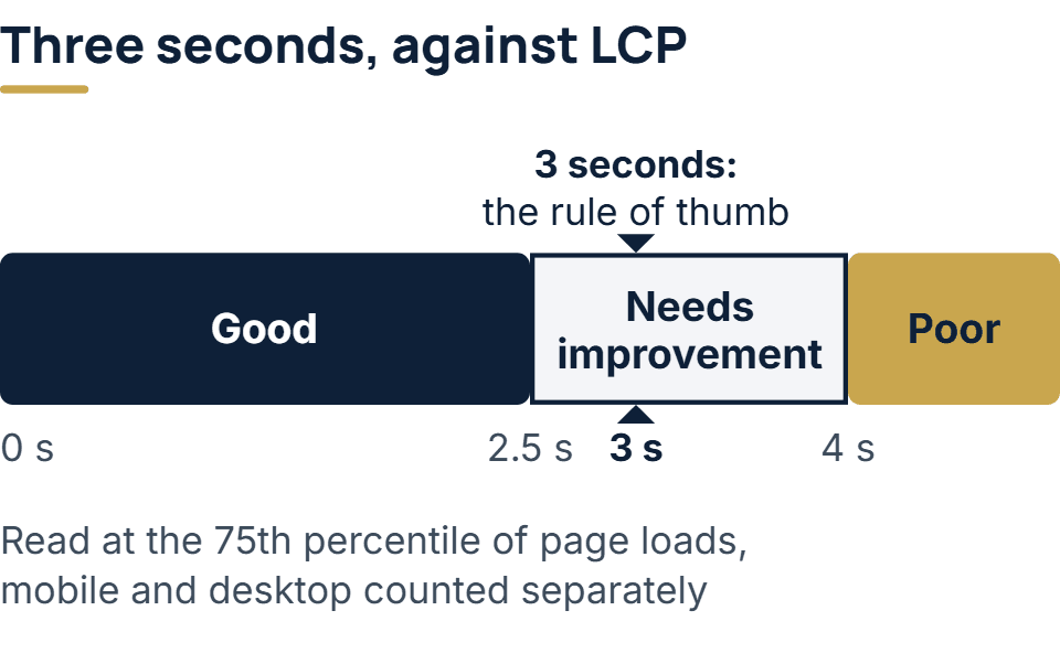
Google’s loading measure is Largest Contentful Paint (LCP): the time until the largest image, block of text or video in the visible part of the screen has rendered. web.dev counts LCP as good at 2.5 seconds or less, as poor above 4 seconds, and anything in between as needing improvement. It is one of three Core Web Vitals. The other two are Interaction to Next Paint, good under 200 milliseconds, for how fast the page reacts to a tap or click, and Cumulative Layout Shift, good under 0.1, for how much the layout jumps while it loads.
Two details change how those numbers should be read. Google judges them at the 75th percentile of all page loads, with mobile and desktop counted separately, so a page passes only when at least three in four visits meet the target. One quick test on a fast office connection proves very little. And the numbers Google reports come from real Chrome visits, through the Chrome User Experience Report. A lab tool such as Lighthouse gives a useful reading before launch, but it simulates one visit and is not the field data Google looks at.
On search, Google Search Central says good Core Web Vitals line up with what its core ranking systems seek to reward, and it recommends that site owners achieve them. It does not say a good score will lift a page above more relevant results, so a fast page still has to answer the search better than the pages around it.
How to check your own site against it
- Run PageSpeed Insights on the pages that matter most. Start with the home page and the landing page that brings in the most inquiries. Read the field data first, since it comes from real Chrome visits. A site with too few visits gets no field data, and then the lab result is the reading you have.
- Look at Search Console’s Core Web Vitals report. It groups pages that behave alike and gives each group a status of Good, Need improvement or Poor, for mobile and desktop, over the last 28 days. A new or quiet site may not show up at all, because Google only lists a group once it has enough data.
- Load the page on an ordinary phone, away from office Wi-Fi. Watch what appears first. If the headline arrives late because a large image or a web font is holding it up, that delay is what your visitors feel.
- Run the message test. Show someone who does not know the business the top of the page as a phone shows it, before any scrolling. Give them a few seconds, take it away, and ask two questions: what does this company do, and what would you click next? If they cannot answer both, the page fails the second half of the rule however fast it loads.
What is the 3 clicks rule?
It is a related rule of thumb that says every page on a site should be reachable within three clicks of the home page. The Nielsen Norman Group calls it arbitrary and not backed by data. The study it cites, by Joshua Porter, found that people did not give up more often, or report less satisfaction, when a task took more than three clicks. What keeps visitors moving is clear menu labels and signs of where they are, such as breadcrumbs. Like the 3 second rule, it takes a real concern and rounds it to a tidy number.
How we build to it
In the custom web development work we take on, each page carries a performance budget: limits on how heavy it is and how fast it loads, which it has to pass in lab tests before it can go live. Core Web Vitals depend on real visitors, so we verify the site in Search Console on the day it launches and read the field numbers there once enough traffic has come through. A budget that holds at launch can slip as new templates, plugins and tracking scripts are added. For WordPress sites, bringing the pages back inside it is part of our software maintenance work.
The message half of the rule is checked without any tool: a headline that names what the business does, and a next step the visitor can see without scrolling.
The full service behind this post: Custom Web Development Services.
Ready to scope your project?
Send us two sentences about what you need. We reply within one business day with the next step and any questions we need answered first.